Designing a tarot deck:
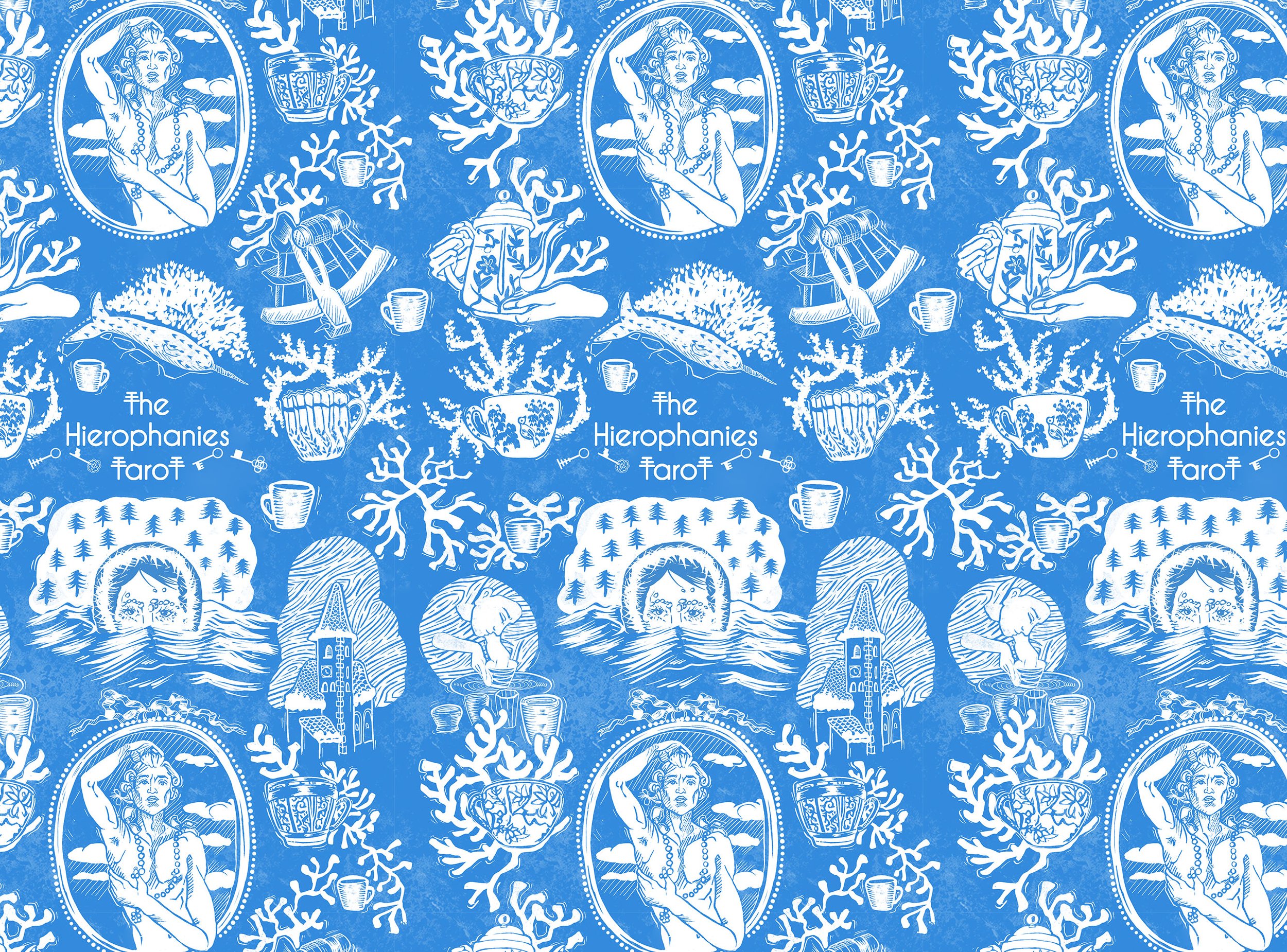
The Hierophanies Tarot:

Designing and illustrating my full tarot deck, The Hierophanies Tarot, took me three years. Here’s an insight into how I did it.
Managing a project as large as a tarot deck was challenging. The Hierophanies Tarot is an 81 card deck- three more cards that a standard 78 card deck. I also chose to draw normal illustrations instead of oversimplified Minor Arcana or ‘pip’ cards.
I write long densely plotted time travel novels, so luckily, I’m no stranger to long projects. I find it satisfying to stay with a project and deepen the meaning of it over time.
Once I knew I was going to illustrate a full deck, I had to decide what kind of deck I’d make. I was inspired by the classic Rider-Waite-Smith deck that is well known globally, so it made sense to use that as an initial reference point. I wanted to strike a balance between respecting the history of the cards ad using what imagery felt most appropriate, updating what suited my needs, but not changing imagery for the sake of change if I was happy with the original imagery/meanings.
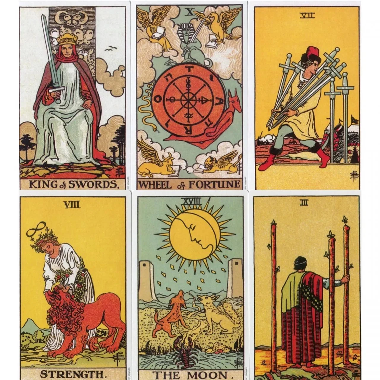
Image: Rider-Waite-Smith tarot
One of my personal favourite tarot decks is The Witches Wisdom Tarot, completely deconstructed the cards, including the Major Arcana, yet still feels faithful to the spirit of the cards.
Diversity is very important to me, and I wanted to create a deck that centred the LGBTQ+ community. I already own a handful of LGBTQ+ decks, and I looked at the ways they’d queered both the meanings and imagery of the cards.
I’m indebted to the outstanding book Queering the Tarot by Cassandra Snow, as it’s only book that I know of that goes very in depth about queering the card meanings. It’s an understatement how helpful this book was in challenging my biases, even as a queer person myself!
Designing a tarot deck:
first cards and colour palettes
The first cards of the deck were created before I knew I’d create a whole deck. I was running a nomadic shop on my narrowboat selling candles, art prints and witchy items, so tarot card prints worked perfectly in the shop. The only thing I was concerned with at that point was making interesting images in a consistent style so they would visually look like a set. I did some initial concept work and thought about worldbuilding- where the characters lived, what materials would they have access to, what symbology was already associated with the card, and what meaning the card had when used in a tarot reading.
Next, I gathered pictures for a moodboard to inspire the look of the deck. I bought several magazines: fashion, lifestyle and travel, and created collages. I also came up with keywords and personality traits for the people/cards, based on their associations. I used these moodboards to visualise the world of each suit, and to inspire the illustrations themselves.
In a tarot deck there are four suits: cups, swords, pentacles and wands. Each suit has court cards- a King, Queen, Knight and page. My initial concept was to create kingdoms for each suit, and the people that live in these worlds and would appear in the deck. Each suit also has a corresponding element, and has tendencies toward different things, for example, cups, being associated with water, tend to represent emotions.
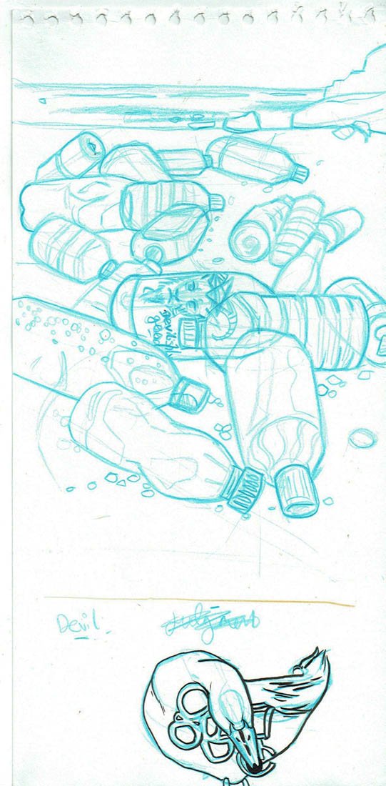
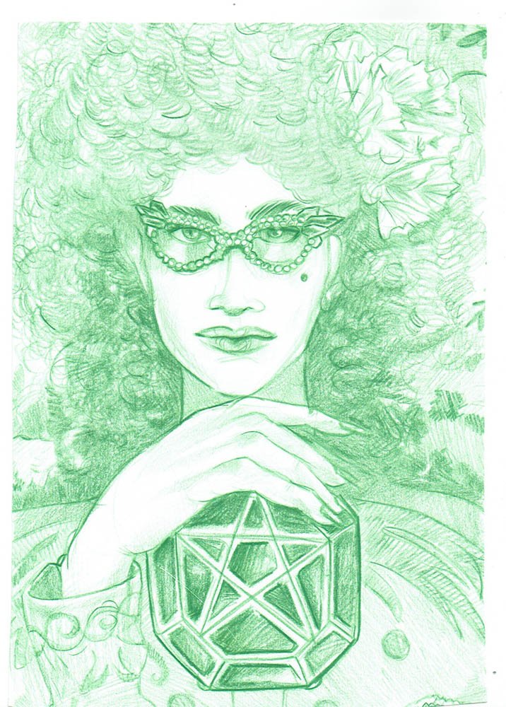
Image: Sketch of The Devil Card
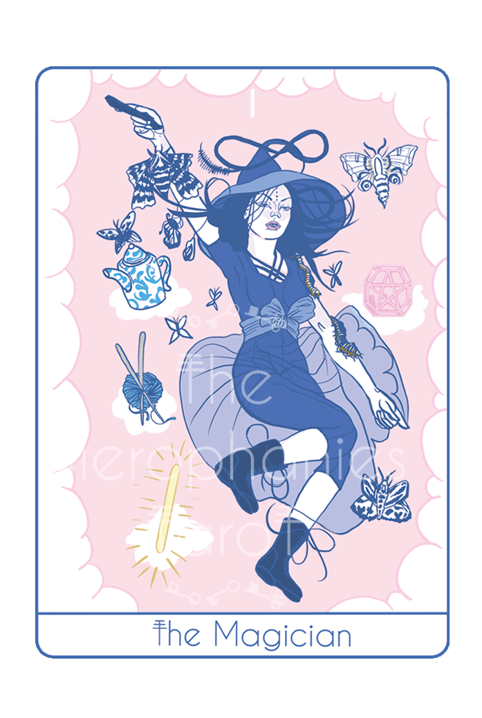
I’m an intuitive person, and believe I channel messages from spirit, so I was open to changing cards that felt like there was a strong message to give. One of my first ever cards was the Devil card. This card traditionally features a devil figure, and is thematically all about addictions, temptations and unhealthy habits, and overconsumption. I illustrated a beach polluted with plastic bottles. It made an appropriate print in my nomadic boat shop where I also sold products that limited plastic bottle waste.
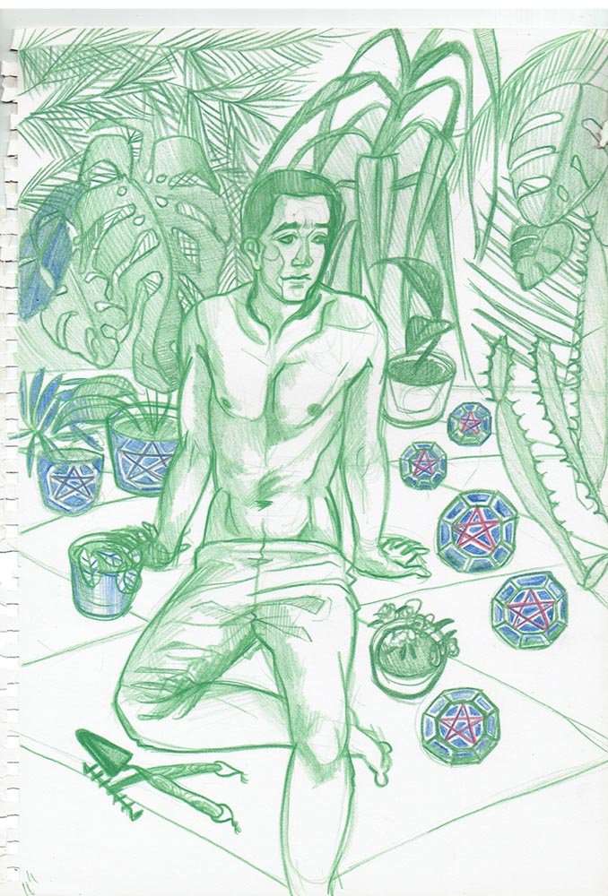
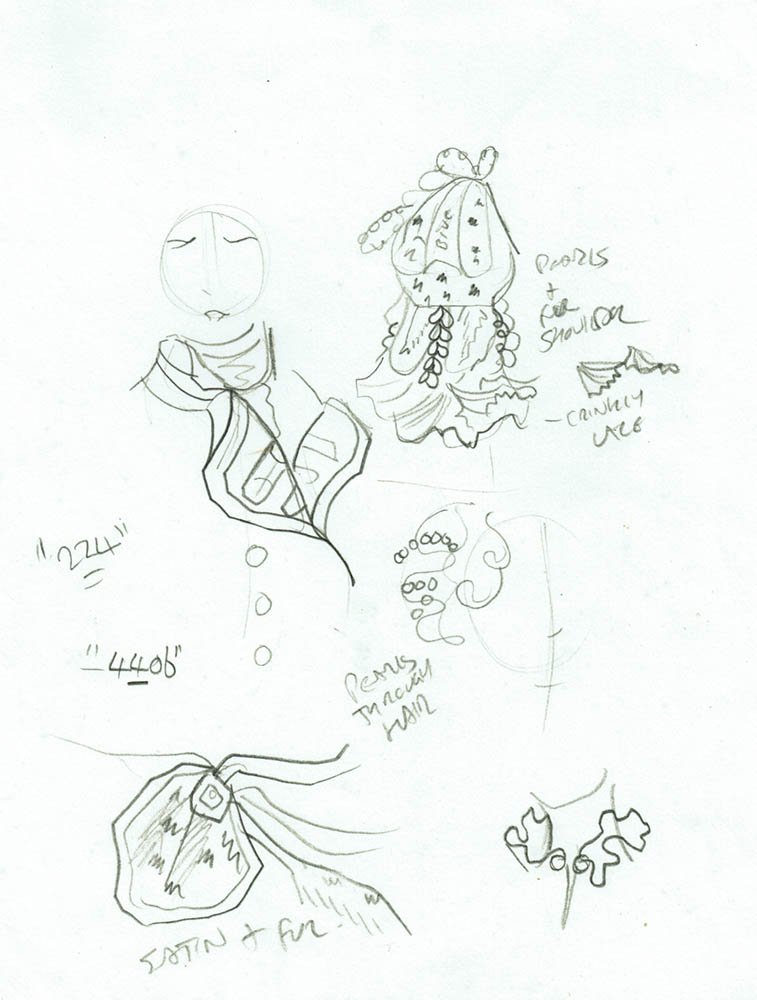
Initial sketches
I tried a few illustration styles and mediums while sketching out initial concepts. The earliest cards were coloured using Copic Marker pens, but I quickly realised that digital illustration would give me a lot more control and allow me to use consistent colour palettes.
I also went to The National Portrait gallery to look at royal portraits for inspiration for the deck. I ended up going for a Tudor inspired look for the Vessels suit, and drew concepts based on fashion from paintings from that period. As this was very early on in the worldbuilding process, I was wondering if all the court cards of each suit would be Tudor inspired, or just the Vessels.
I also drew inspiration from natural shapes found in the sea, such as shells and sea creatures.


Colour palettes
All four suits have their own distinct colour palette. I planned these this offline with marker pens and a physical colour wheel to create four tertiary schemes. I used my visual collages as reference to get a sense of what colours should go where- for example, it made sense to give warm greens, reds and pinks to the Pentacles suit, which is associated with earth and nature.
For Cups, I gave cool greens and warm blues.
For Blades, (traditionally Swords) I gave all the cool blues and red violets.
For Pentacles, I gave pinks and true and yellow toned greens.
And Wands I gave orange, red and blue violet.
Luckily none of the colour palettes overlapped- a suit may have red in it, but only one suit got orange-red, and another got red-violet. I was lucky that I only needed four palettes- if I needed more, I would have had to either really limit the colours in each palette or have several overlapping colours.
The Major Arcana posed a problem. What colour scheme should I use for these 21 cards? Should they all look consistent? Do they have to?
I decided was to assign each of the Major Arcana cards into the suits. Each card has a planetary association, which means it also has an element associated with it, and this allowed me to assign them into the suits. This means my Major Arcana cards conform to one of the four suits- so they have the correct colour scheme, and they fit into the world of that suit. However, I did choose to change one or two of the cards and reassign them into suits based on what I felt about the card. The Devil card that I mentioned earlier became associated with the cups (water) suit and I coloured it appropriately.

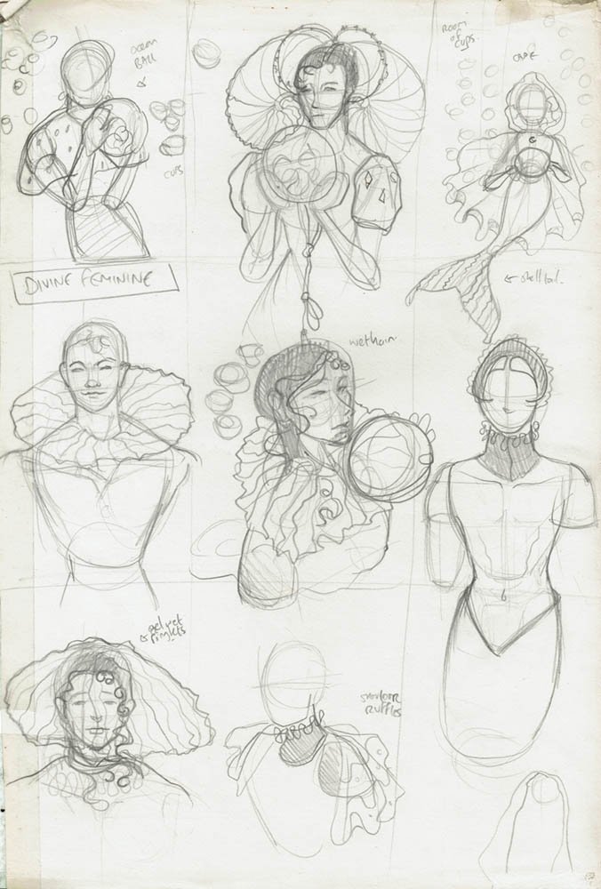
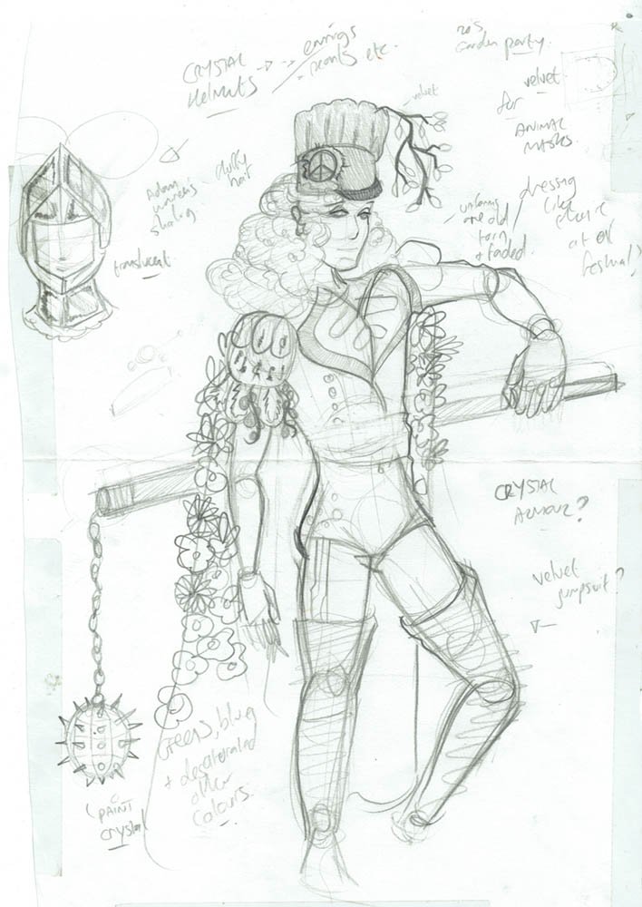
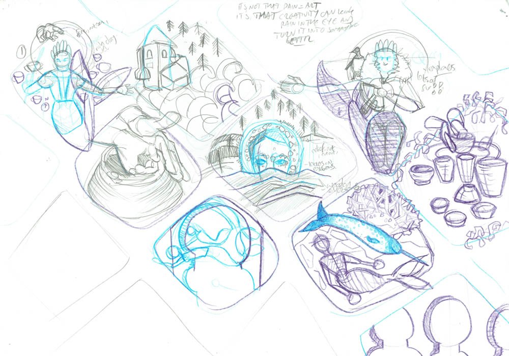
Illustration process: thumbnailing
Once I had a good idea of the worldbuilding, themes and colours I’m going to use, I began designing the suits and the rest of the Major Arcana of the deck.
As an illustrator, my process for a card deck is to thumbnail, letting myself be as messy as I want early on, and refining the sketch as I move forwards. If I’m working on a commission, I’ll refine the thumbnails before sharing them with a client, but as they’re just for my own benefit on my own project, these initial thumbnails can be as messy as I want.
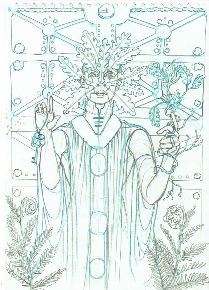
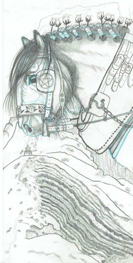
I may also do preparatory drawings at this stage. For the Hierophant card (see below) I drew some oak tree leaves from life before I went into thumbnailing, as I felt that the shape of the leaves would help me with the composition of the card.
At this early stage I’m mostly concerned at this stage whether the cards communicate the meaning of the card visually, and if they thematically work as a suit.
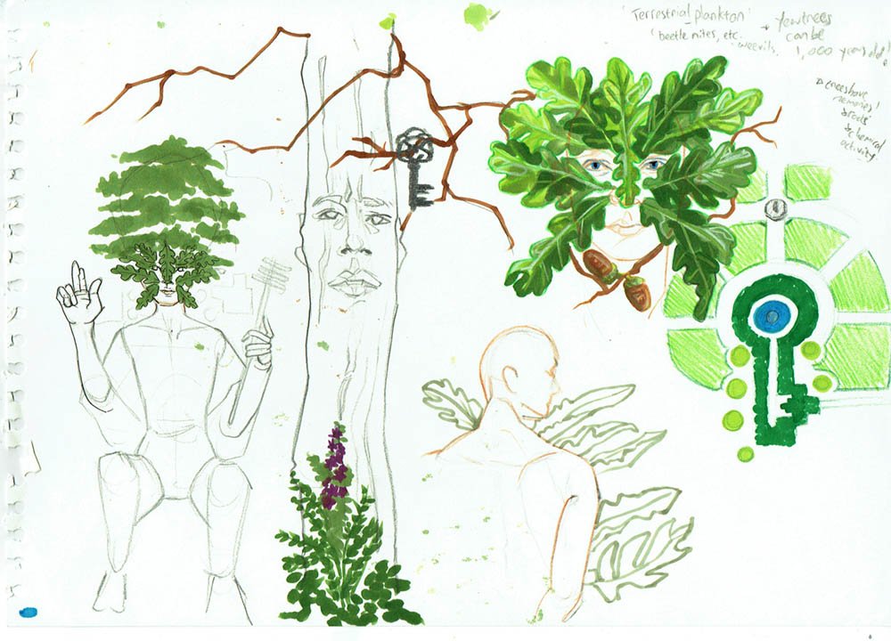

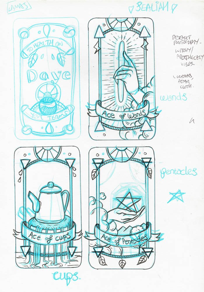
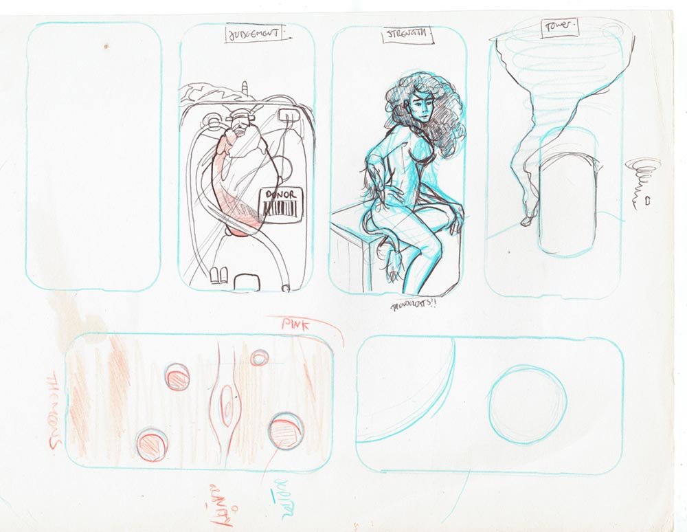
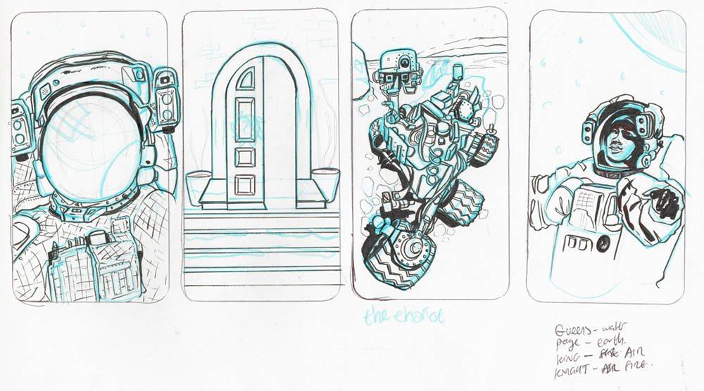
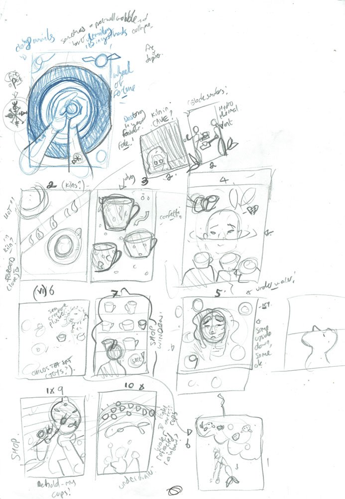
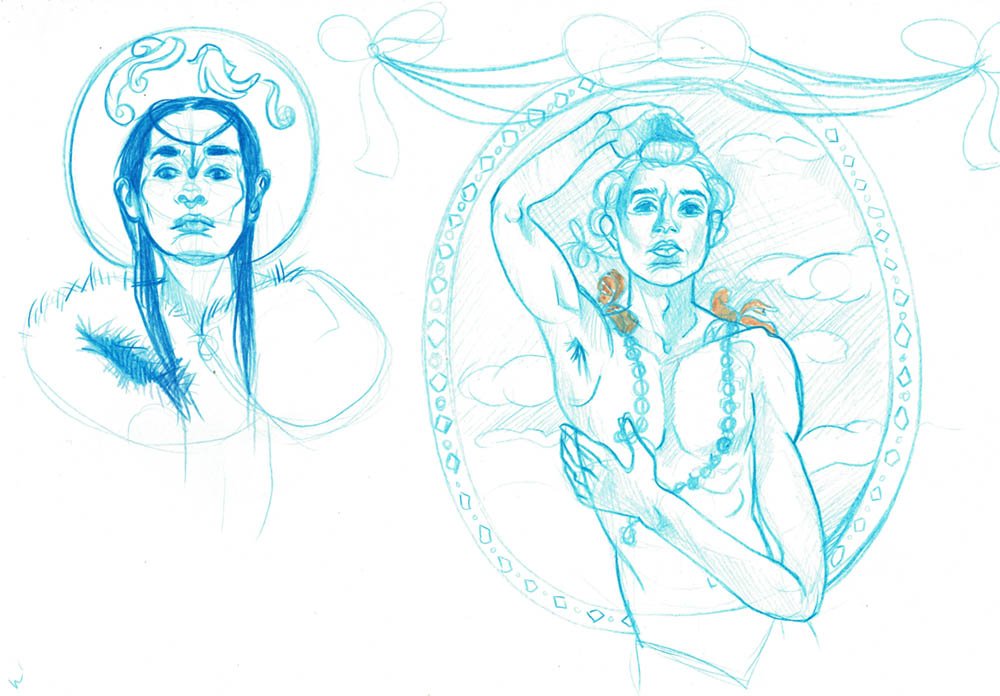
Illustration process: refining a sketch
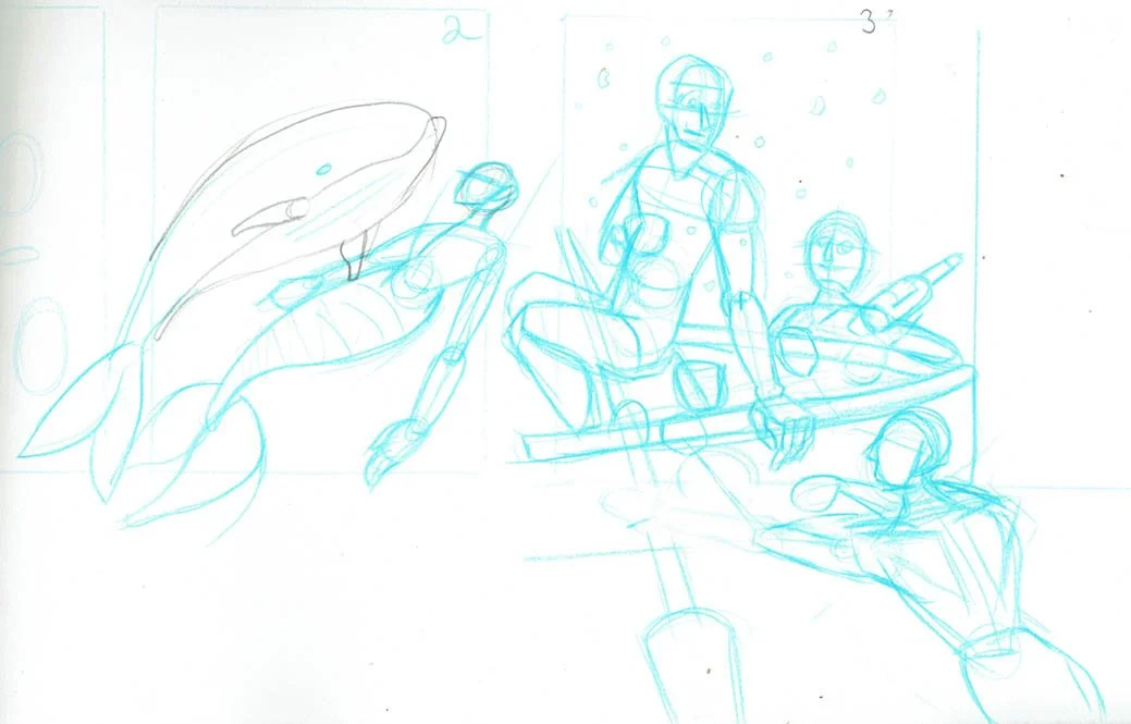
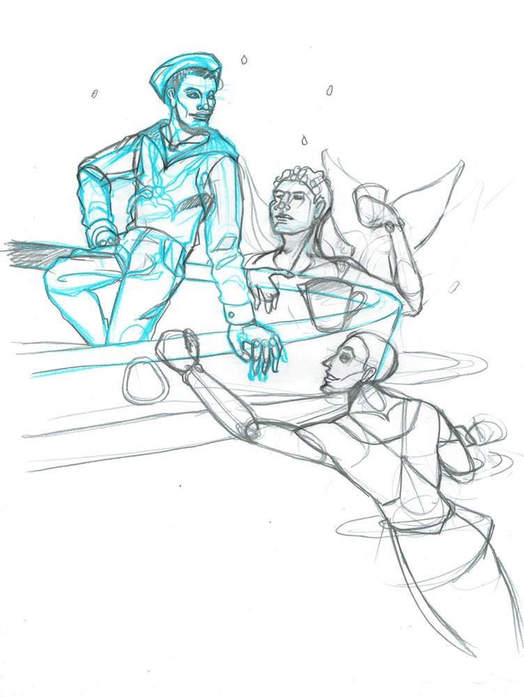
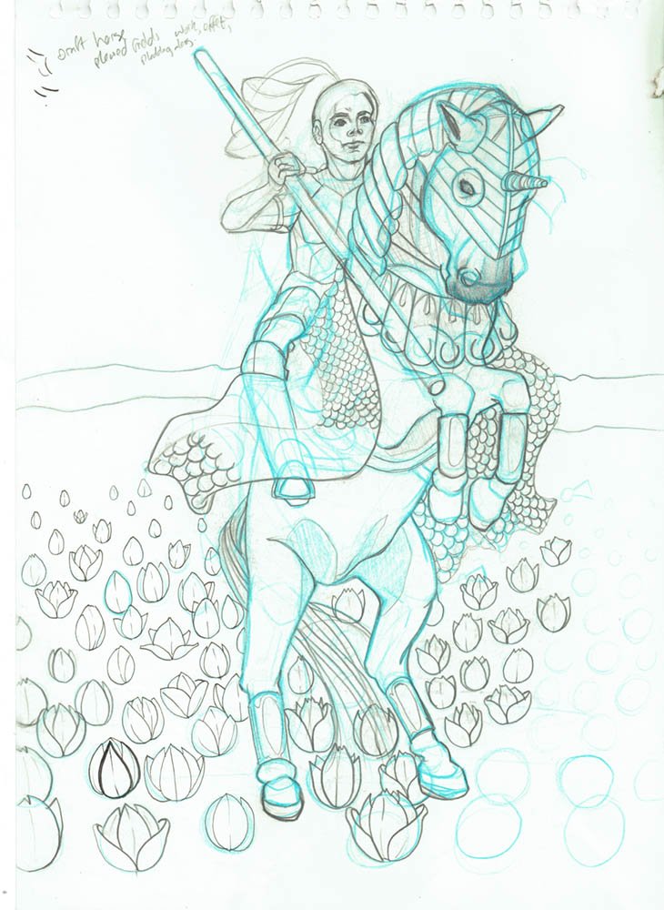
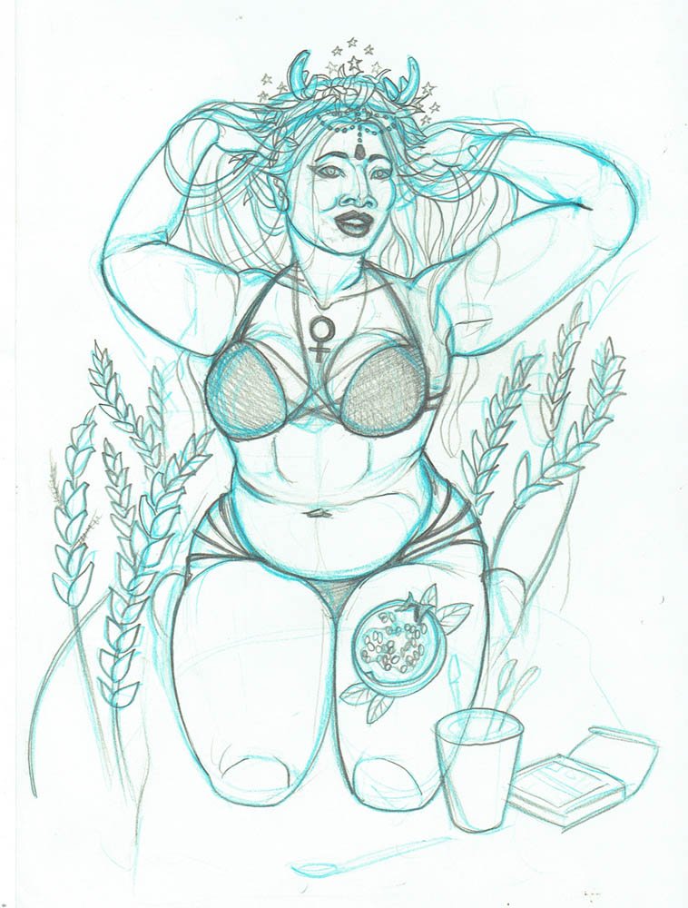
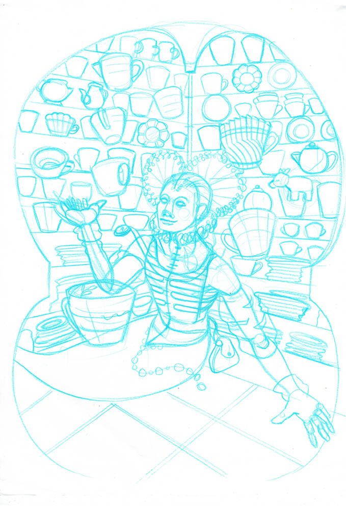
As you can see from the images above, I enjoy working in blue pencil and refining a graphite sketch on top of it, but sometimes I’ll decide to just start a whole new sketch if I want to try another composition. It depends how complex the drawing is, and how I feel about the initial sketch.
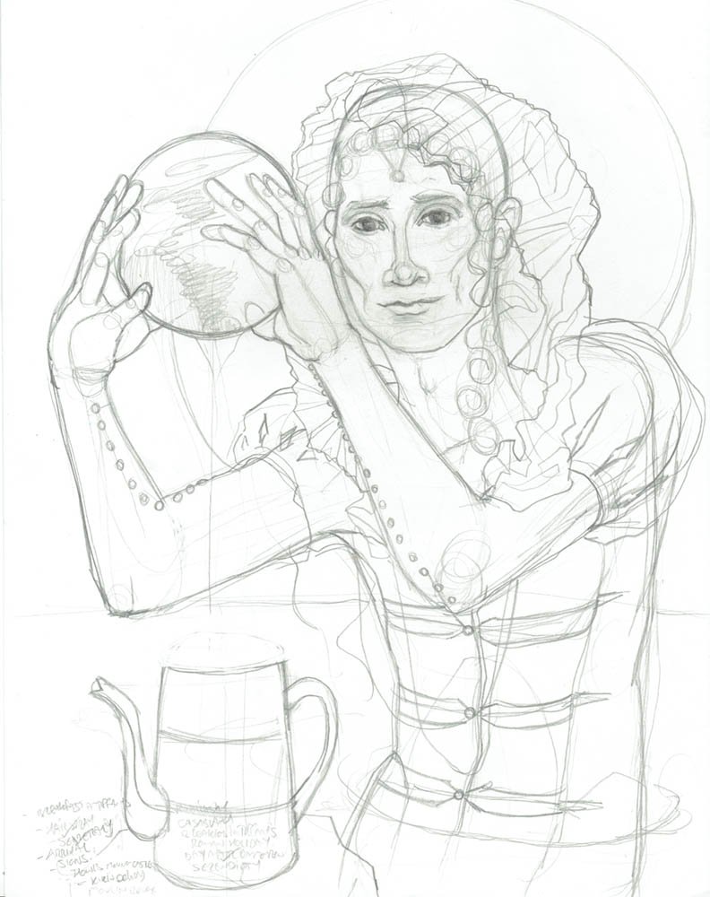
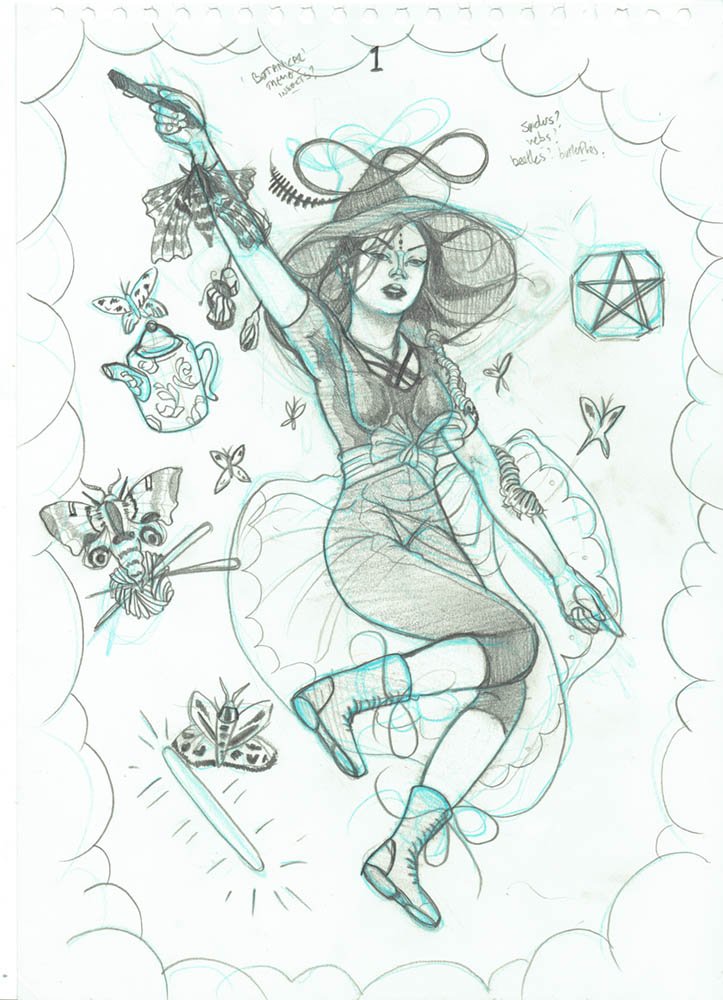
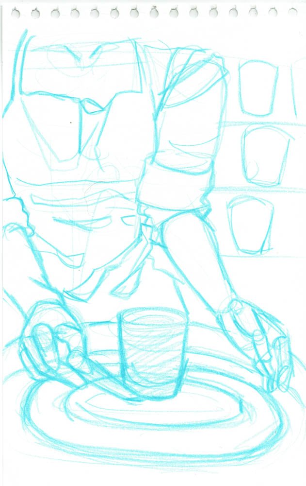
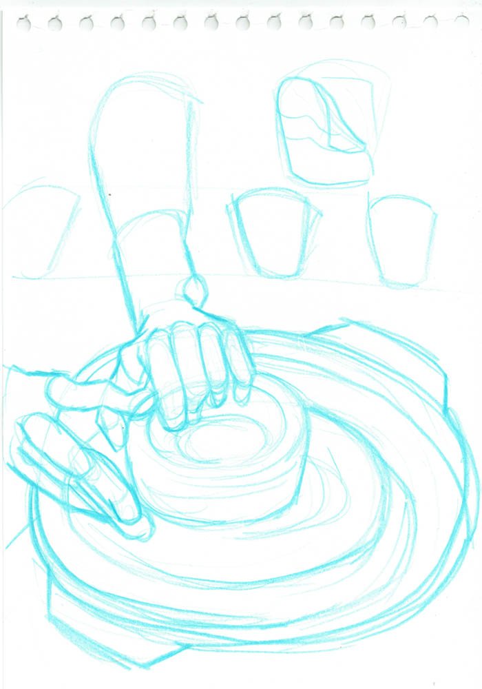
I also like to work out character poses and bodies in blue pencil before I do more refining. In my initial thumbnails I draw loose gestures rather than clear figures, so it’s important to work out final poses before I move forward.
You’ll see in the gallery below that I tried out a couple of poses on A3 paper in blue pencil for my Wheel of Fortune card, as hands can be very expressive and I wanted to see a couple of options larger than normal before I moved into refining further with graphite pencil.
I use a lightbox when cleaning sketches, but sometimes I also like to ink over the top quickly to see how something will ink digitally.
Inking and Colouring
For this project I inked my lineart digitally using Photoshop on my large graphics tablet, but I preferred to colour in Procreate.
Earlier in the process I also coloured in Photoshop, but I I began using Procreate and an apple pencil a year into the deck’s creation, and it really quickened my workflow being able to colour cards while out and about. For example, I coloured some cards while on a train, waiting at train stations, in coffee shops, etc. Once I was happy with the sketch and the lineart was completed, it felt very relaxing colouring the cards.
Because of this, I began improving my workflow more- inking cards on my mac and then loading them onto my iPad, and uploading them to my iCloud, to be coloured in batches. I did do some lineart on my iPad too, but I mostly preferred the quality of lines on Photoshop- because I was using a bigger tablet I could use my arms and wrists more fluidly than I could on an iPad screen.