Wes Anderson The Archives | Design Museum
This is my response to a {speculative} brief from the Design Museum to provide illustration for items in the gift shop inspired by objects in the Wes Anderson Archive exhibition.
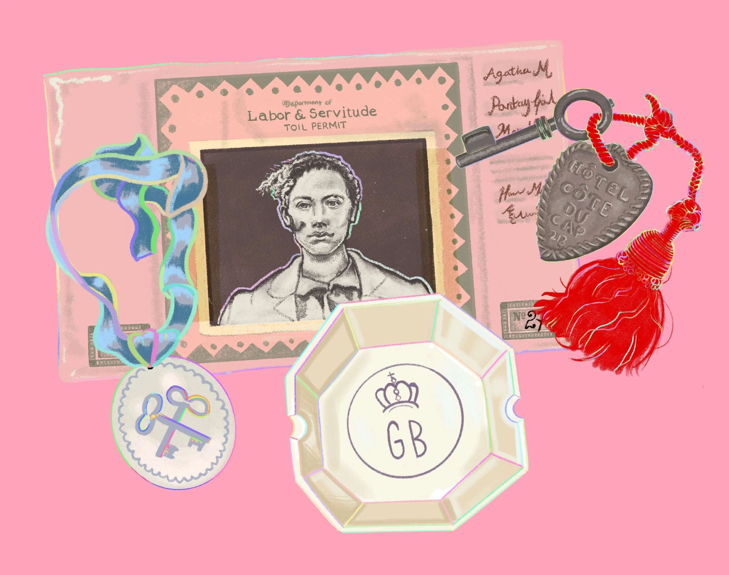
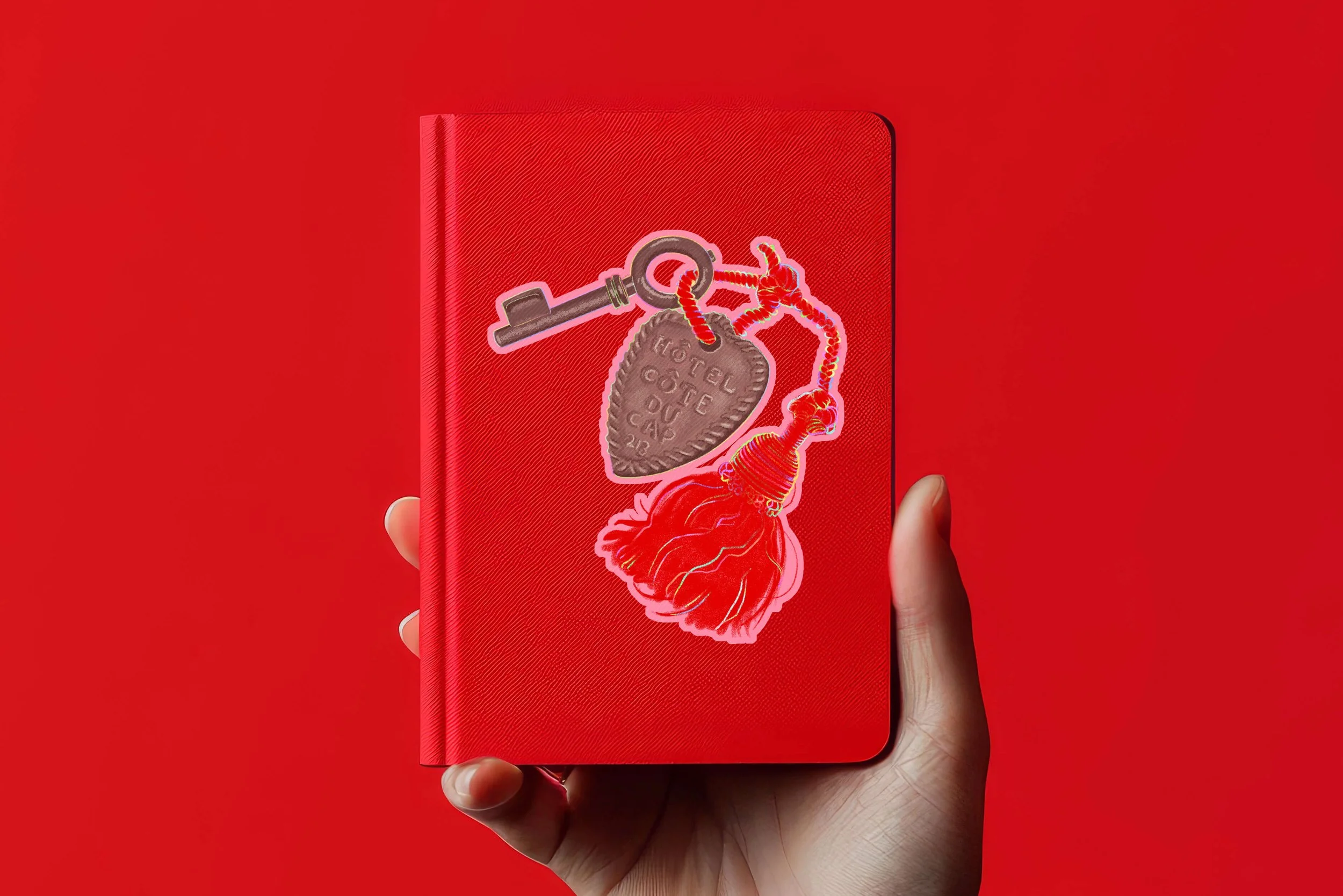
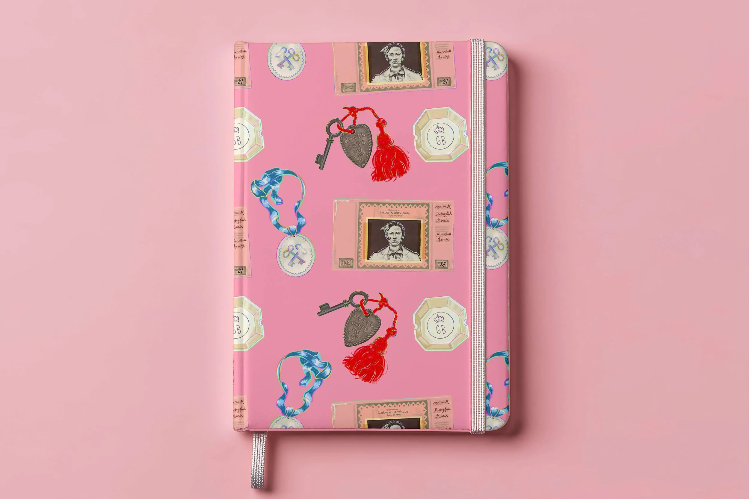
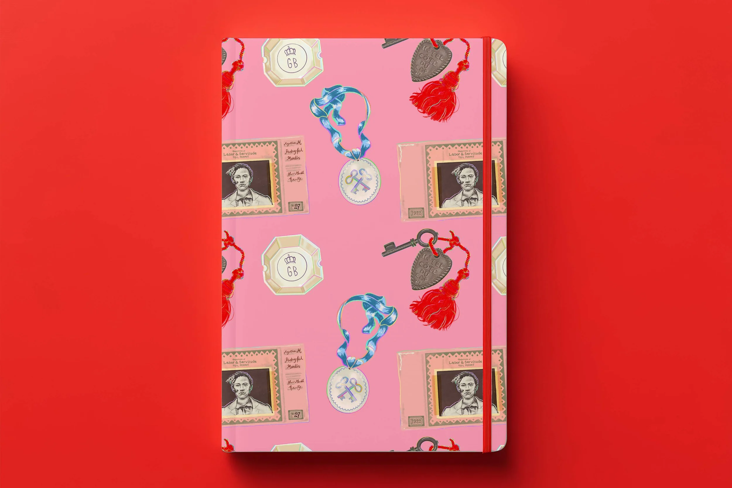
For this brief I illustrated a mixture of popular and lesser known objects from the Archive collection at the museum. I kept to a limited palette of colours from The Grand Budapest Hotel that overlapped with Wes Anderson’s common use of pink and red together.
-
Client: Design Museum
Project: Illustrated Object Series – Wes Anderson: The Archives
Commission Type: Freelance Illustration (Retail & Editorial Applications)Project Overview
To coincide with Wes Anderson: The Archives, the Design Museum is seeking an illustrator to produce a series of artworks inspired by key objects, props, and set details featured in the exhibition.
Rather than directly reproducing film stills, this commission focuses on interpreting objects as design artefacts—highlighting their materiality, symbolism, and role within constructed worlds.
The final illustrations will form a flexible visual suite used across retail, editorial, and interpretive contexts and should include 1 repeating pattern design for seamless tiling.
They were particularly interested in work with a strong sense of authorship.
1. Retail Products (Primary Use)
Your illustrations would likely be adapted into:
Postcards or boxed postcard sets (object “collections”)
At least 1 repeating pattern design for seamless tiling
Notebooks and journals (with repeating or modular designs)
Tote bag or cushion (single-object hero designs)
Stationery sets (stickers, bookmarks)
Each illustration should work both:As an individual “hero” image
As part of a set or system
Creative Direction
We are looking for a cohesive series of illustrations that:
Isolate and elevate iconic and lesser-known objects from across Wes Anderson’s filmography
Emphasise composition, symmetry, and colour logic
Treat each object as part of a broader visual system or taxonomy
Tone & Aesthetic
Precise, intentional, and highly composed
Playful but controlled
Rooted in observation, but not purely referential
Should evoke the feeling of Anderson’s worlds without mimicking film stills
Product Considerations
The work should sit at the intersection of:
Illustration as product (commercial appeal)
Illustration as interpretation (museum context)
Must work at both distance (readable as pattern) and close inspection (detail-rich)
Avoid overly fine lines that may be lost in print
Colour palette should consider retail visibility (shelf impact)
-
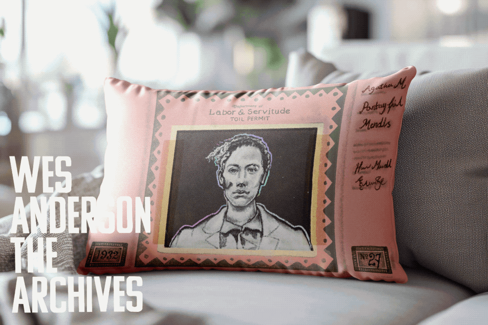
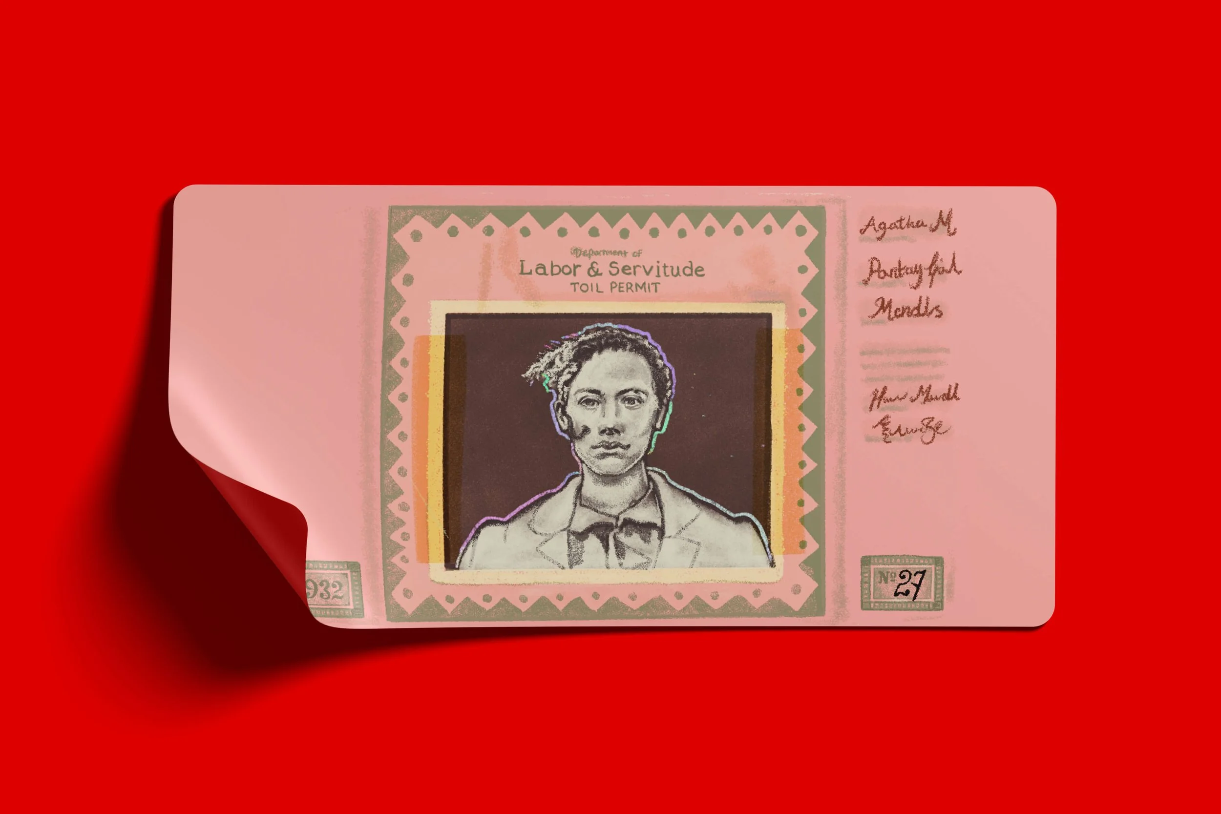
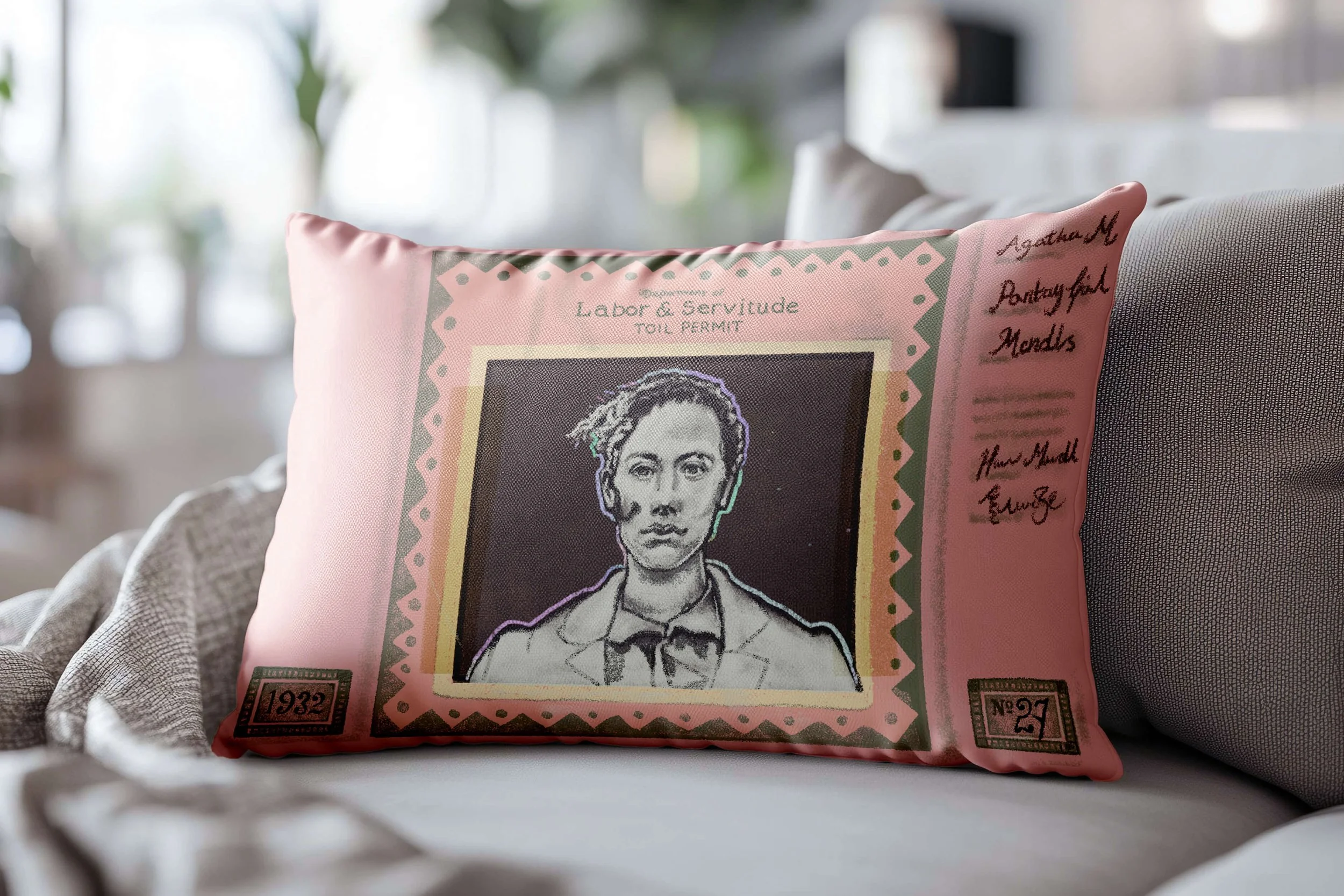
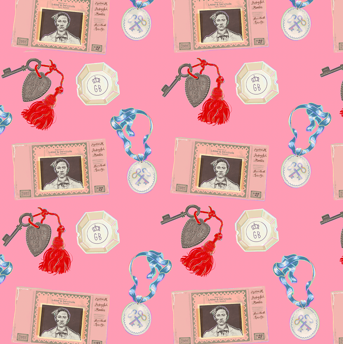
For this brief I illustrated a mixture of popular and lesser known objects from the Archive collection at the museum. I kept to a limited palette of colours from The Grand Budapest Hotel that overlapped with Wes Anderson’s common use of pink and red together.
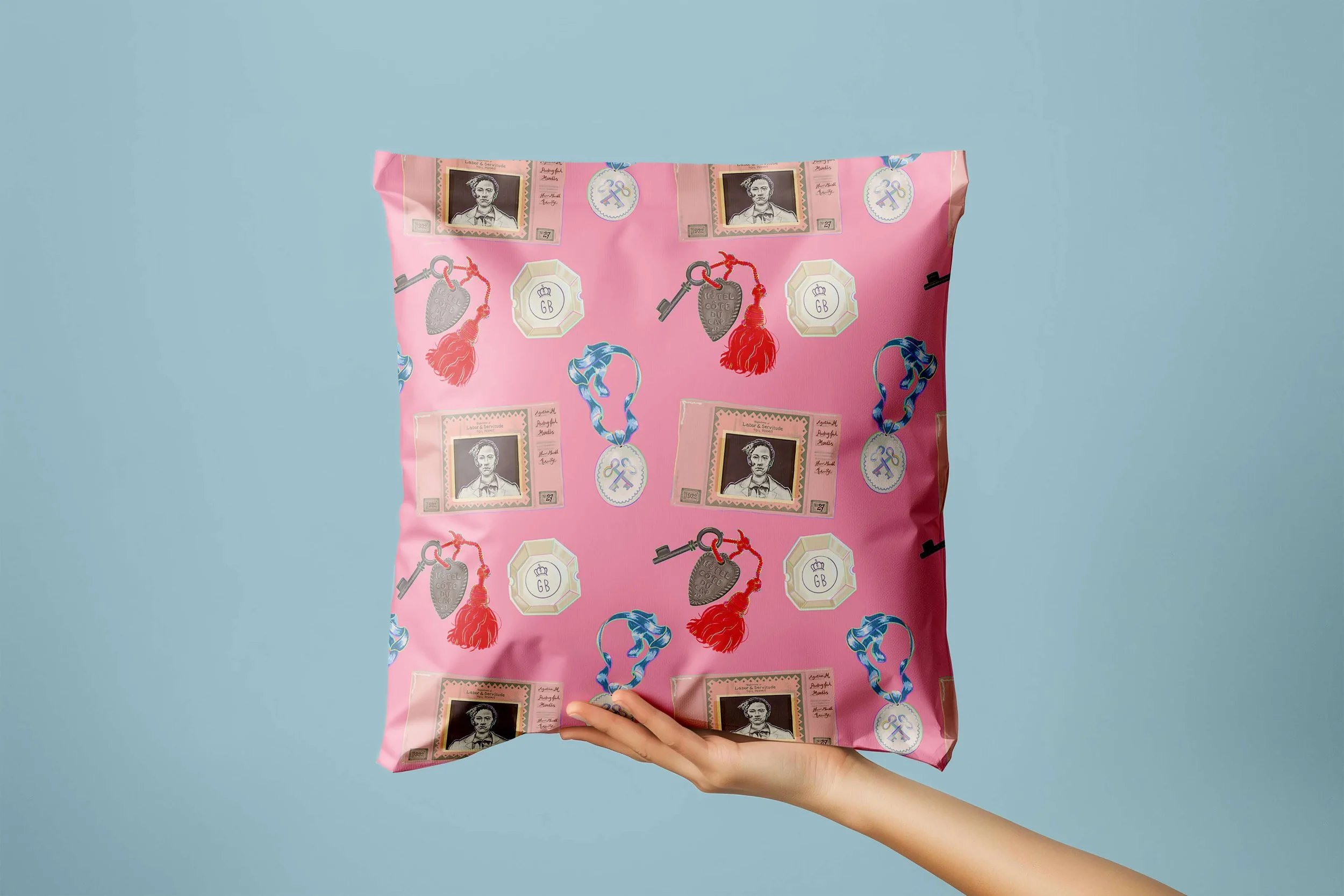
I designed one surface design pattern in iconic pink, changing the details of the key to red to give the iconic combination. The design can be read from far away and up close.
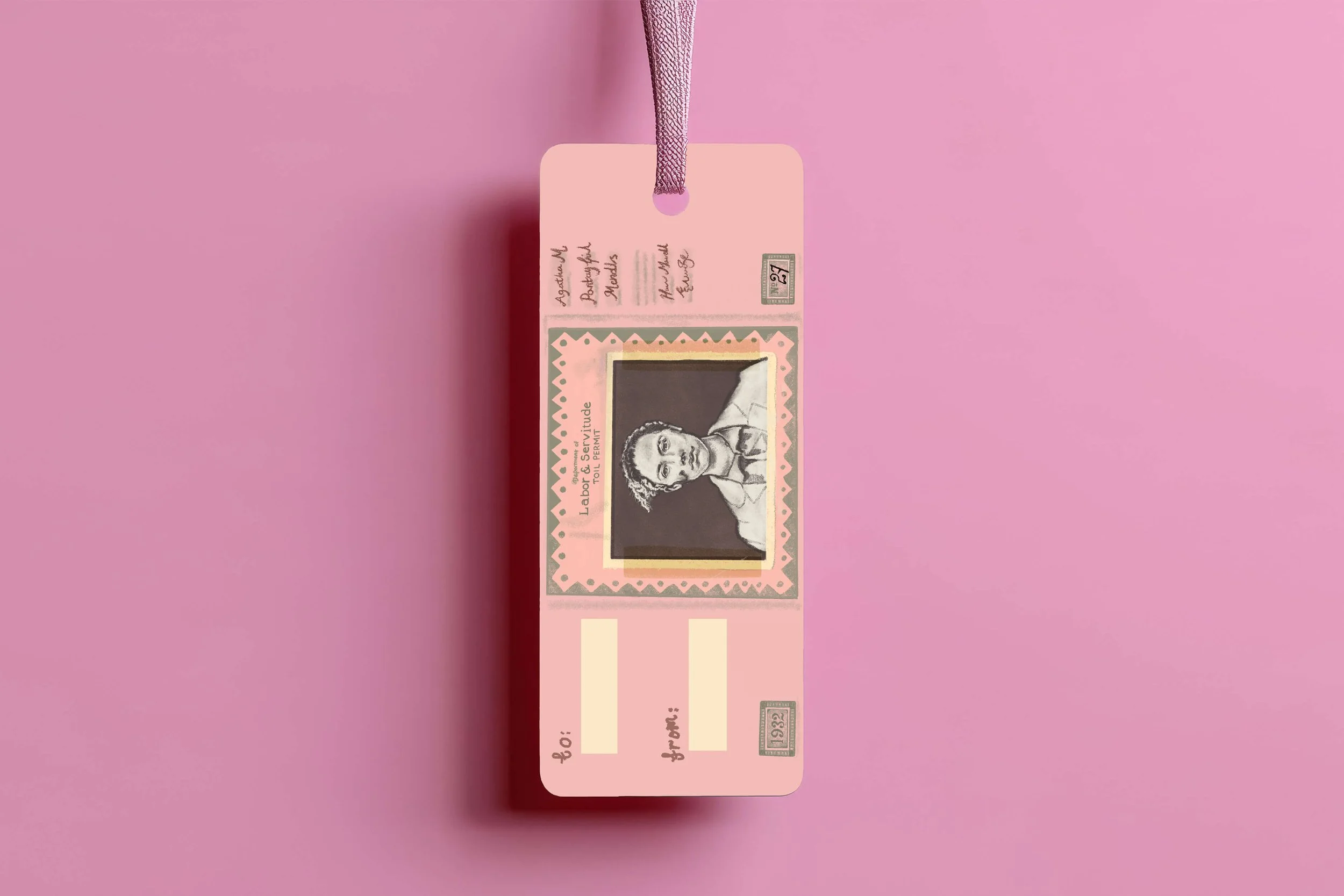
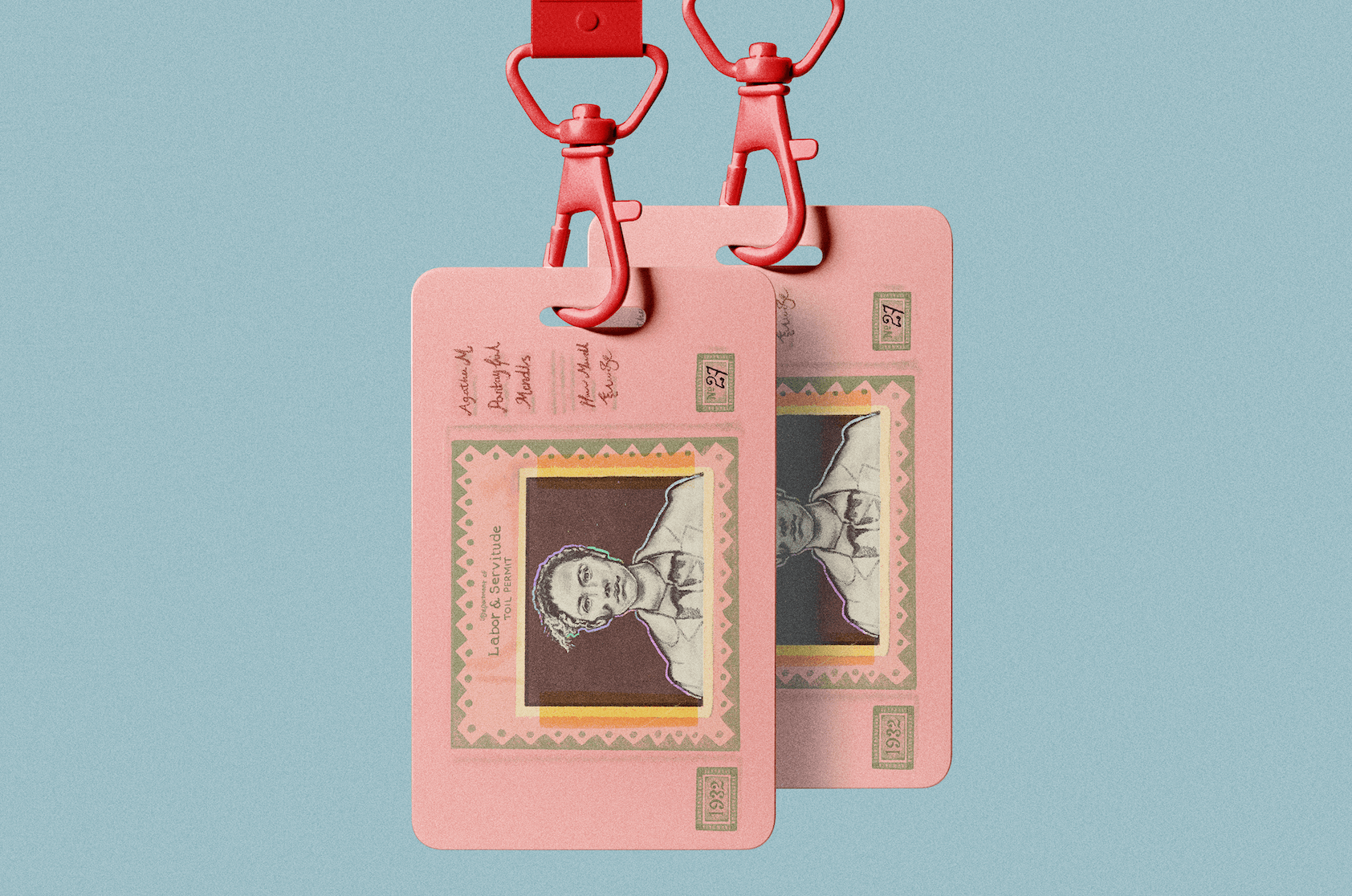
For the hero image I chose the work permit as it was designed on pink paper which suited the rest of the surface design, and which I think looked brilliant on many gift shop objects, and could also be added to paper products such as gift cards etc.
The objects from the design could also be used separately as hero images, such as how I used the key on a notebook.